Blog Feed

Project (10-13) – Final Design – Arden

This week, shading and small touch ups to the design were done. I’m not particularly great at shading to start with, though I think it turned out alright.

Though, I found it particularly difficult. Due to the colour scheme already being quite dark and learning how shadows project from a light source takes time.

Final Design of Arden

Referring back to a passage from Project (6-9) Gear. Arden was based off of the Keres, malevolent spirits of violence, death and disease.

The black Dooms gnashing their white teeth, grim-eyed, fierce, bloody, terrifying fought over the men who were dying for they were all longing to drink dark blood. As soon as they caught a man who had fallen or one newly wounded, one of them clasped her great claws around him and his soul went down to Hades, to chilly Tartarus. And when they had satisfied their hearts with human blood, they would throw that one behind them and rush back again into the battle and the tumult.

Redfield, J. (1994). Nature and culture in the Iliad: The Tragedy of Hector. Durham: Duke University Press.

Though they functioned like the Valkyrie of Norse mythology – I chose to omit the wings that mythology suggested they have. Though, the final design still ended up being inspired by the bird, the Vulture.

Overall, I’m happy with how Arden turned out.

Exegesis

Exegesis

Introduction

The creative project I underwent for this unit was intended for enjoyment; to reignite the love I had for drawing when I was younger, as I have not done something for the simple pleasure of it in some time. As Csikszentmihalyi (1996) states, “Perhaps the most important quality, the one that is most consistently present in all creative individuals, is the ability to enjoy the process of creation for its own sake”. As discussed in my proposal, after brainstorming, the Idea I thought fit this concept was a character design. In particular, creating a backstory and character that I felt could translate well into a gaming environment. This project is important to me as my major is graphic design, where drawing can play a large role. As a challenge I chose to incorporate “creativity in technology” as a part of the project, in the form of digital art; due to wanting to learn something along the way. For these reasons, i considered the abilities of the character to be out of scope, and hence would be excluded from this design process.

Inspiration & Execution

Character design requires a vast amount of creative energy as it is an arduous task, it involves creating concepts, artwork, backstory and even personalities from scratch (Concept Art Empire, 2018). As a result of my research I noticed that the character design process no matter where you look is largely similar. Though, to streamline my process, I planned on referring to Tillman (2011)’s method to character design; the three-point turn around. The turn-around consists of the characters front, side and back view. Though, before the turn-around I decided on a backstory, explored colour schemes based on existing work and compiling my own, and then sketched multiple iterations of the various parts of the character and evaluated what I thought best fit. “Sketches help to convey ideas, demonstrate functionality, visualize user flow, and illustrate anything that requires human interaction” (Tufts, 2014). I started with body-type, then moved on to clothing, hairstyle, weapons and then their face. In this process, I found it increasingly difficult to come up with a truly original idea, I noticed myself constantly influenced by personal taste, and areas of popular culture.

Context

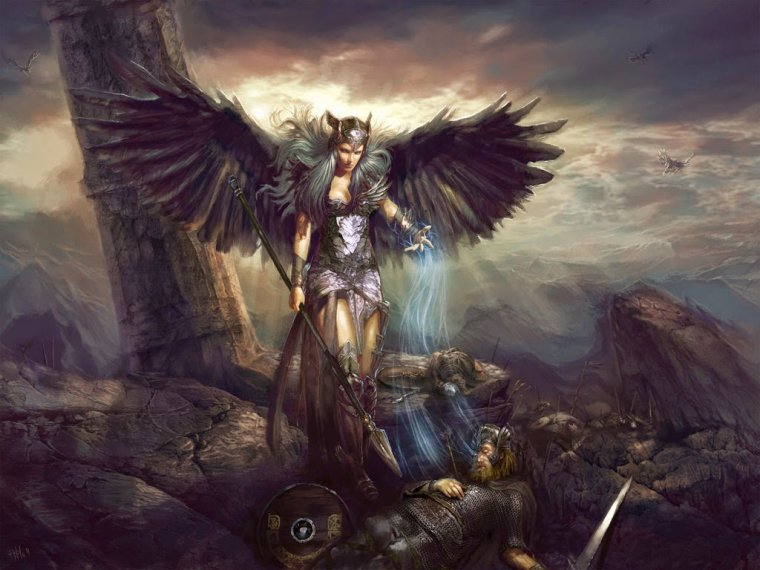
Due to time constraints instead of constructing my own story I took inspiration from Greek mythology, a vast well of folklore and characters, pinpointing a passage that piqued my interest from “The Shield of Heracles” revolving around the Keres. The resulting design framed my personal interpretation of the character from the passage. According to Satell (2014) technology expands possibilities and enhances creativity. Therefore, forgoing the physical medium and transitioning to digital art made sense to me. The purchase of a pen tablet enabled me to utilize software on my personal computer such as Clip Studio Paint. This meant I had vast amounts of creative freedom. This freedom took the form of options such as picking the style of pen, pencil, brush or blending technique that I desired, as well as having access to a vast range of colours should I wish to use them. Furthermore, the tablets ability to capture pen pressure allowed for lines to seem more natural, making the transition from paper to the digital realm easier. Furthermore, I noticed that the turn-around itself is a form of design thinking. Having all the details already available (front, back and side view), means I have defined their needs, created ideas and helped construct the beginning of a prototype for testing (Dam & Siang, 2019).

Detail

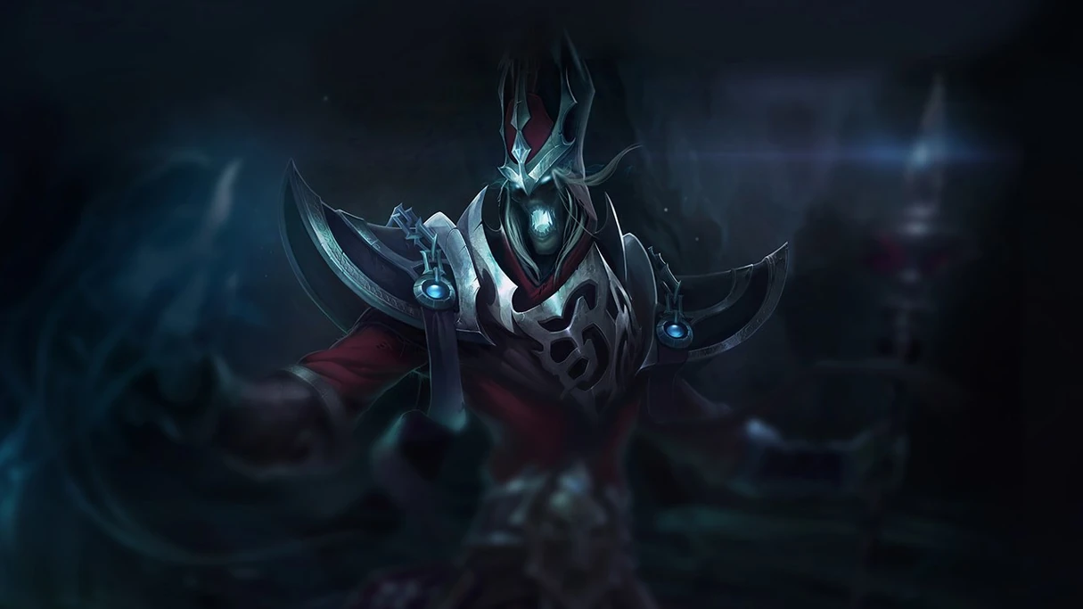
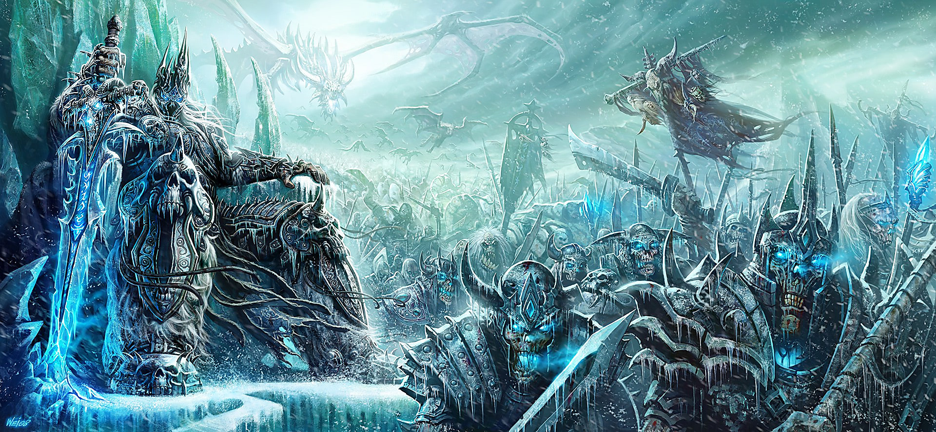
My project came with various complications. For example, as I was still learning how to use my tablet, tasks were taking longer to complete than originally planned. These time constraints led me to abstain from my original proposal of a three-point turn around hence I removed the characters side-view. Given the backstory I chose, and Tillman (2011)’s advice I sketched my ideas based on the backstory, this constraint meant that my sketches needed to remain medieval and bird-like in nature. This may seem like it limited my creativity, but I felt it did the opposite. The limitations of the medieval theme meant I had more freedom to explore the fantasy genre in interesting ways to explore the bird aesthetic I was chasing. For example, my original idea the long flowing feathery dress, comparative to the final outfit, with the vulture collar, the sleek black armour, the cloth acting as the bird tail and the weapon resembling talons. The change was made due to the realisation that the dress didn’t fit the malevolent Valkyrie theme that the passage possessed. The colour scheme I chose for my design was based off areas of pop-culture that deal with similar “otherworldly” characters, for example the Lich King from World of Warcraft. Though, during my research I learned that colours can be used to influence emotion (Moore, 2014). For example; the colours of blue, green and black subtly evoke tones of coldness, unfriendliness, enervation, and efficiency (Wright, n.d.). Interestingly, i learned that this set of colours is dubbed “Haint Blue” and was utilized in the past to ward off spirits (Roberts, 2017).

Conclusion

In closing, this project was a big step into the world of digital art for me. It took me out of my comfort zone and helped me learn about creativity in technology; in the form of digital art. Though there were some hiccups along the way, it let me combine two of my interests: mythology and drawing. Additionally, the resulting two-point turnaround of my character design turned out better than I thought even with my inexperience. Additionally, in terms of my graphic design I was able to learn that colours themes are not coincidental, with colour psychology a large amount of thought goes into picking a scheme in order to provoke certain emotions. I enjoyed this process and I hope to continue with digital art in the future.

References

Concept Art Empire. (2018). What is Character Design? (And What Does A Character Designer Do?). Retrieved from https://conceptartempire.com/character-design/

Csikszentmihalyi, M. (1996). The creative personality. Psychology Today, 29, 36-40. Retrieved from http://ezproxy.ecu.edu.au/login?url=https://search-proquest-com.ezproxy.ecu.edu.au/docview/214474433?accountid=10675

Dam, R., & Siang, T. (2019). What is Design Thinking and Why Is It So Popular?. Retrieved from https://www.interaction-design.org/literature/article/what-is-design-thinking-and-why-is-it-so-popular

Moore, J. O. (2014). True Colors: Using Color to Convey Emotion in Art. Retrieved from https://www.craftsy.com/art/article/using-color-to-convey-emotion/

Roberts, E. (2017). Why do so many Southern porches have blue ceilings?. Retrieved from https://www.today.com/home/what-haint-blue-here-s-why-southern-porches-have-blue-t115573

Satell, G. (2014). How Technology Enhances Creativity. Retrieved from https://www.forbes.com/sites/gregsatell/2014/01/27/how-technology-enhances-creativity/#5ea3bdac3f50

Tillman, B. (2011). Creative character design. Burlington, MA: Focal Press. Retrieved October 23, 2019, from https://www-sciencedirect- com.ezproxy.ecu.edu.au/book/9780240814957/creative-character-design

Tufts, K. (2014). Why Sketching Is An Important Part of The Design Process. Retrieved from https://www.dnnsoftware.com/blog/why-sketching-is-an-important-part-of-the-design-process

Wright, A. (n.d.). Psychological Properties Of Colours – Colour Affects. Retrieved from http://www.colour-affects.co.uk/psychological-properties-of-colours

Project (10-13) – Face

Eyes

Eye Choices
  • Top Left:
    • I felt this set of eyes was perhaps too feminine and formal to fit with the “warrior” theme
  • Top Middle:
    • I liked this set, though to me I felt that it was far too innocent looking, again not fitting the “warrior” theme.
  • Top Right:
    • I felt this option fit the most, It didnt look too feminine or formal, and it showed signs of a furrowed brow indicating concentration
  • Bottom Left:
    • Once again this set looked far too feminine and formal for my taste, I also didnt like how close they came together in the center.
  • Bottom Right:
    • I liked this set, like the top right option, it wasnt feminine or formal and it showed signs of furrowing. Though I feel like it was perhaps a little too “harsh” on the female face.

Mouth

Mouth Choices

The above shows a set of mouths I drew to appear somewhat scary/malevolent. Playing with ideas like fangs and sewn shut mouths, your typical “scary” traits.

My choice however was the Top-Left Option, as I felt it still felt “Malevolent”, and it wasnt too over the top like the others. Below is the two options together, and colourized.

Eyes and Mouth

The final touches to the face was the nose, as the character has been drawin in an anime-style, I chose to keep the nose simple. The design of the nose reminds me of Voldemort from Harry Potter.

Nose

Below is the complete character “designed”. The final touches are coming soon in the form of shading.

Project (10-13) Weapon

This week, I needed to decide on the weapon I would like them to use. My first attempts were based on using “feathers” as weapons.

Feather-Blade 1st Attempt

Feather-Blade 2nd Attempt

Wing-Blade

Claw / Knuckler

The above designs, while I liked them i didnt think they fit the “agile” look the character was developing. So, thinking back, recalling the bird aesthetic – I never did utilize the “Talons” aspect of birds. I thought this would be a good idea for a weapon, In any case the design I came up with also reminded me of Wolverine from X-Men.

Character – So Far

Up next – the final aspect of the character design before i start to shade it – the face.

Project (10-13) – Hairstyle

I started off with a basic, short and neat look. Though nice, i thought it was very plain.

Short Bob

The next iteration of the hairstyle, I decided to extend the length. This was a better result, though, again still rather plain.

Hime/Princess Cut

The next iteration i went for a more disheveled/wild look. I liked this. Though, I wanted to revisit the shorter hairstyles.

Disheveled Hime/Princess Cut

Back to the “Short Bob” as a quick passing idea, I removed the fringe. Though this look striked me as very “formal” and not really what I was hoping for.

Formal/No Fringe Bob

Third attempt at revisiting the short hair, I took the classic short, trimmed bob and made it a little more wild and unkempt, though I was happy with the backside of the hair so i kept it the same. Still not quite what I wanted.

Disheveled Bob

This one, I felt was the winner. Though I wanted to develop it some more, I felt something was missing.

Disheveled Bob with Side-Swept Fringe.

Doing some doodling, I came up with this. It reminded me almost of a feathery headpiece.

Doodling

Running with the headpiece Idea, I refined it some more.

Refined Idea.

So, even though I originally intended to move away from long hair, adding the headpiece brought it back in. Below is the hair added to the figure, with the colour scheme to match.

Reflection – Project Problems

It is now nearing the end of Week 8 of the semester. I feel like i’m slightly behind on what I originally planned to do. This is due to me underestimating the workload I had this semester across all my units, and perhaps also expecting “too much” from myself. To rectify this, I decided to remove the “side” view of the character design that I originally planned on.

Additionally, I’m happy with the quality of work I’ve put out so far. Though, at the same, I’m avoiding one part of the work. This being shading. Shading has never been my strong suit, so right now the character design looks very flat, as it’s all solid colours. I don’t want to completely avoid It, and so I’ve decided I’m going to do all the shading at once towards the end of the design.

The part of the project that I plan on completing sometime this week is the various hairstyles to choose from. I look forward to having fun designing these.

Reading Response #2

Reading Response #2

Augmented Reality in Visual and Spatial Design

Within recent years, virtual and augmented reality have taken the world by storm, popularized publicly through the world of gaming. For virtual reality, the user detaches themselves from the real word through a headset and interacts with a virtual space. Augmented reality however aims to create a link between the digital, and physical world, shadowing you and adding additional information to the world around you, for example the popular mobile game Pokemon Go, adding virtual monsters to the world around you to capture (See Figure 1) (Downey, 2016). The reading “The Gigantic List of Augmented Reality Use Cases” by Downey (2016) outlines a myriad of instances that augmented reality will impact on within my field; Visual and Spatial Design.

Figure 1: Man playing Pokémon Go (Source: Hall, 2016)

3D modelling and design is perhaps at the forefront for the designer, augmented reality allows us to “create and view 3D models in physical space” (Downey, 2016). Instead of wasting weeks on countless drawings and paper prototypes, the designer can provide the client with 3D mock-ups. This removes the clients imagination from the equation and allows them to see, and interact with the designs in real space, whether this be billboards, brochures or building plans. Potentially speeding up and increasing project affordability based on client interaction and contentment with the virtual product before production begins (See Figure 2) (Artwork Abode, 2017).

Figure 2: Viewing Architectural Design in Augmented Reality (Source: Inition, 2014)

As an extension to 3d modelling, Downey (2016) outlines the capacity to “visualize changes to your living space before making them permanent”. This includes nuances like changing wall colours or art and furniture placement. For a designer, this is a hugely helpful tool when interacting with clients, client apprehension severely diminishes when they are able to see their ideas in real time without physically altering the space and costing them money. Doubt all but fades away given the fact they can see and make changes in an instant like furniture size, colour scheme and material (See Figure 3) (Internation School of Colour and Design, 2019).

Viewing furniture placement in augmented reality (Source: Space-O, 2019)

So far, the areas mentioned within the article by Downey (2016) that benefit Visual and Spatial design focus on the product. However, Downey (2016) suggests that more nuanced areas exist, such as sentiment analysis. Augmented reality provides an interface to scan people and analyse their body language, micro-expressions and behaviour to get real-time feedback in regards to how the individuals are feeling and reacting to the meeting or project allowing you the designer to make suggestions and accommodate their needs appropriately (Downey, 2016).

Conclusively, there is however, some worry surrounding this trend of augmented reality. With all of these tools being developed and being readily available to the public, for free such as Shopify (2019)’s augmented reality shopping experience. I believe this to be of no consequence however, as there are always those who lack a creative eye. If you are seeking quality, hire those who have the creative ingenuity you seek. Hence, designers are the future of augmented and virtual reality (Artwork Abode, 2017).

References

Artwork Abode. (2017). The Role of Graphics Designers in Virtual Reality. Retrieved from https://www.artworkabode.com/blog/role-of-graphics-designers-in-vr/

Downey, S. (2016). The Gigantic List of Augmented Reality Use Cases. Retrieved from http://uploadvr.com/

Hall, L. (2016). Gaming Psychology: Is Pokémon Go Good Or Bad?. Retrieved from https://www.opencolleges.edu.au/careers/blog/gaming-psychology-pokemon-go-good-or-bad

Inition. (2014). 3D Printing & AR for Drees & Sommer. Retrieved from https://www.inition.co.uk/case_study/drees-sommer-building-information-modelling/

Internation School of Colour and Design. (2019). Augmented Reality – What does this mean for Interior Design?. Retrieved from https://www.iscd.edu.au/augmented-reality-what-does-this-mean-for-interior-design/

Shopify. (2019). Shopify AR – Augmented Reality for ecommerce & online stores. Retrieved from https://www.shopify.com.au/ar

Space-O. (2019). 3 Ways to Use Augmented Reality in eCommerce App Development. Retrieved from https://www.spaceo.ca/augmented-reality-in-ecommerce-app-development/

Project (6-9) Gear

Originally, I thought of my character as only a “messenger” of the Fates. So, my original idea for clothing was to be graceful, long and flowing (See Below).

This didn’t satisfy me, as i thought it was quite dull and basic. Leaving no room to design other pieces of clothing.

Looking back, literature such as The Shield of Heracles (248-57) seems to suggest that the Keres functioned like the Valkyrie of Norse mythology, though more malevolent.

The black Dooms gnashing their white teeth, grim-eyed, fierce, bloody, terrifying fought over the men who were dying for they were all longing to drink dark blood. As soon as they caught a man who had fallen or one newly wounded, one of them clasped her great claws around him and his soul went down to Hades, to chilly Tartarus. And when they had satisfied their hearts with human blood, they would throw that one behind them and rush back again into the battle and the tumult.

Redfield, J. (1994). Nature and culture in the Iliad: The Tragedy of Hector. Durham: Duke University Press.
Image result for valkyrie
Valkyrie from Norse Mythology (Source: Magic Horoscope)

This then gave me the idea to don them in armor, though I wanted to keep the bird/vulture aesthetic.

With further refinement, the inspiration for this design stems traditional knight armor, Game of Thrones and the female warriors of Wakanda. Whilst trying to stay near the “vulture” aesthetic.

The Armor

The Inspiration

Overall, I’m happy with the second design I came up with. Though it definitely needs some fine tuning. For example, the detail in the breastplate is not as obvious, and I need to learn how to shade still.

Project (6-9) Colour Scheme

Given that my character design is based around the underworld of Greek mythology, I need to find a fitting colour palette. The best way to do this is research other depictions of otherworldy / undead characters and sampling their primary colours.

Colour Samples

Karthus – The Deathsinger (League of Legends)
The Graveborn – AFK Arena
The Lich King and the Scourge – World of Warcraft

From the above images, its evident that the colour scheme for the undead remains rather consistent, utilizing varying hues of blues, greens whites and grey-blacks. Hence, no matter what I draw next, they will adhere to this colour scheme.

Project (6-9) Figure

Female Body Types by Annykos

The Female body comes in various shapes and sizes, seen above.

  • The Rectangle
  • The Apple / Round
  • The Hourglass
  • The Pear/Triangle
  • The Inverted Triangle

For the my character design, the body types I will be comparing and picking from are the hourglass, the pear/triangle and the rectangle.

The Pear

The Hourglass

The Rectangle

From the above figures, I favor the hourglass figure the most with the rectangle as a close second. From this, decision I can now start looking at facial features and hairstyles.